How to Read Japanese Candlesticks in Trading?
Introduction to Japanese Candlestick Charts
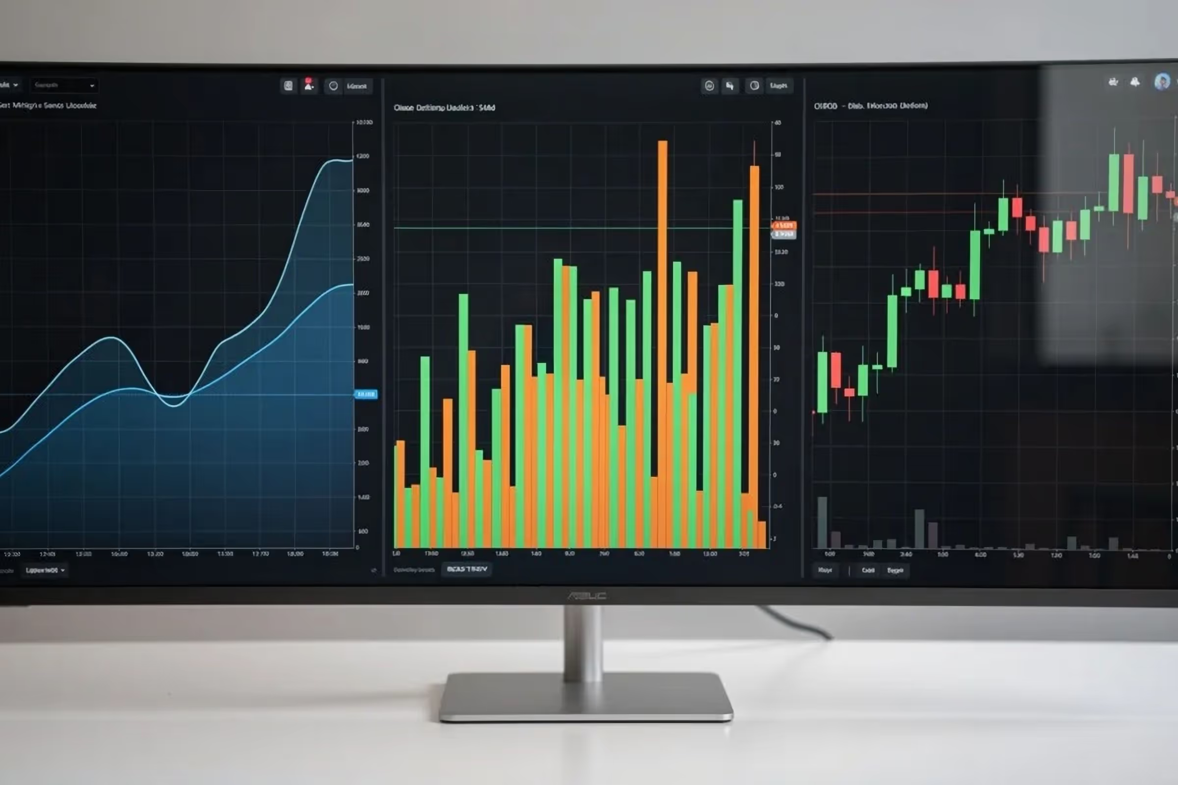
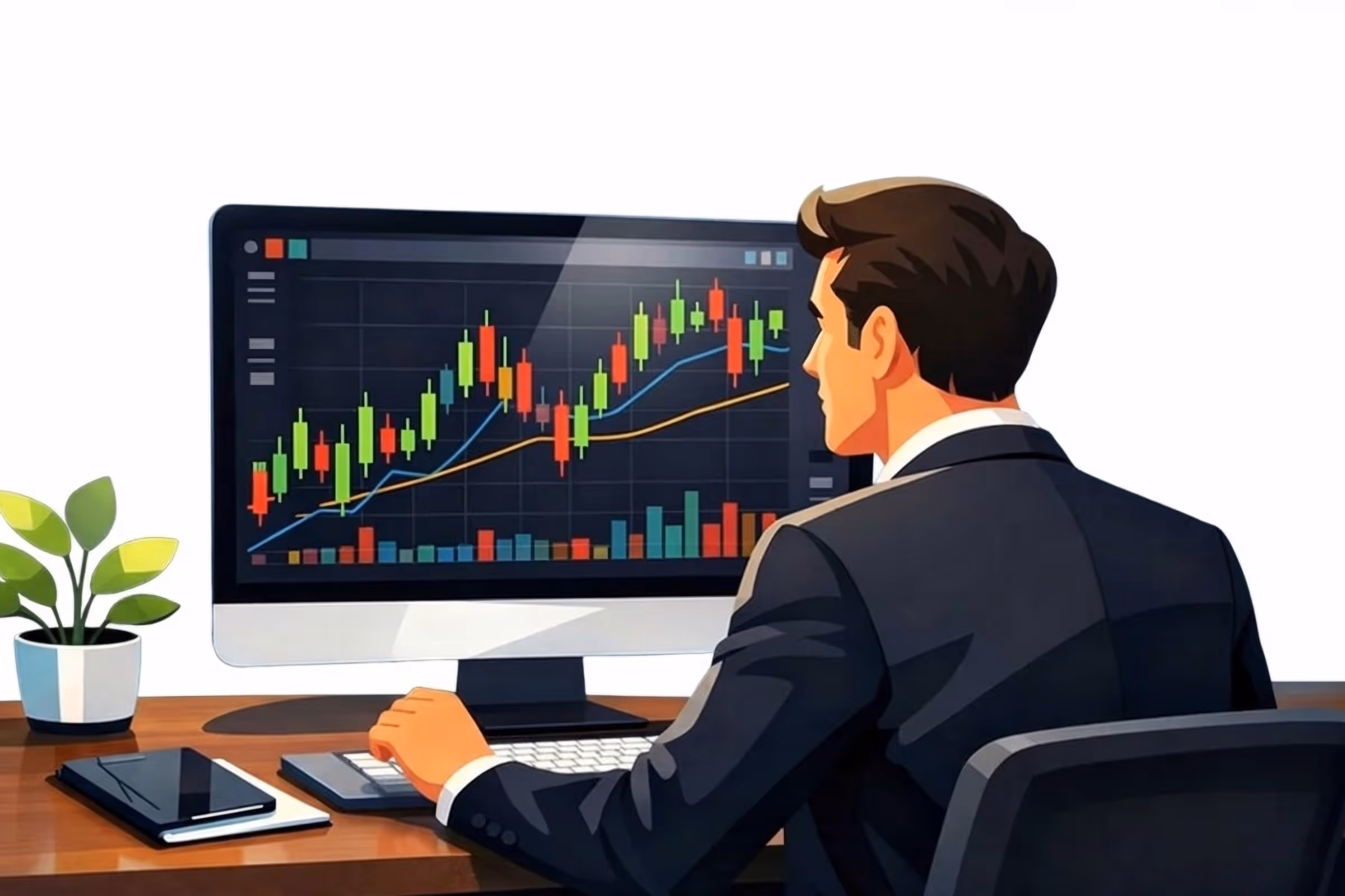
When you open a charting platform for the first time, the first thing you will see is a price chart. Depending on the platform and its default settings, the chart may appear in different formats. Most commonly, you will see one of three types: line charts, bar charts, or candlestick charts.
For beginners, this can feel confusing or even a little overwhelming. At first glance, the chart may look like a collection of random lines and shapes that are difficult to interpret. However, once you understand what these charts represent, they become valuable tools for analyzing the market. If you are just starting your trading journey, you may find it helpful to first understand the structured learning process I describe in my article on the key steps beginners should take when learning to trade.
If you want to learn more about how traders do research and analysis, I explain the difference between approaches like technical and fundamental analysis in my article titled “What Type of Analysis Should You Use to Read Charts?”
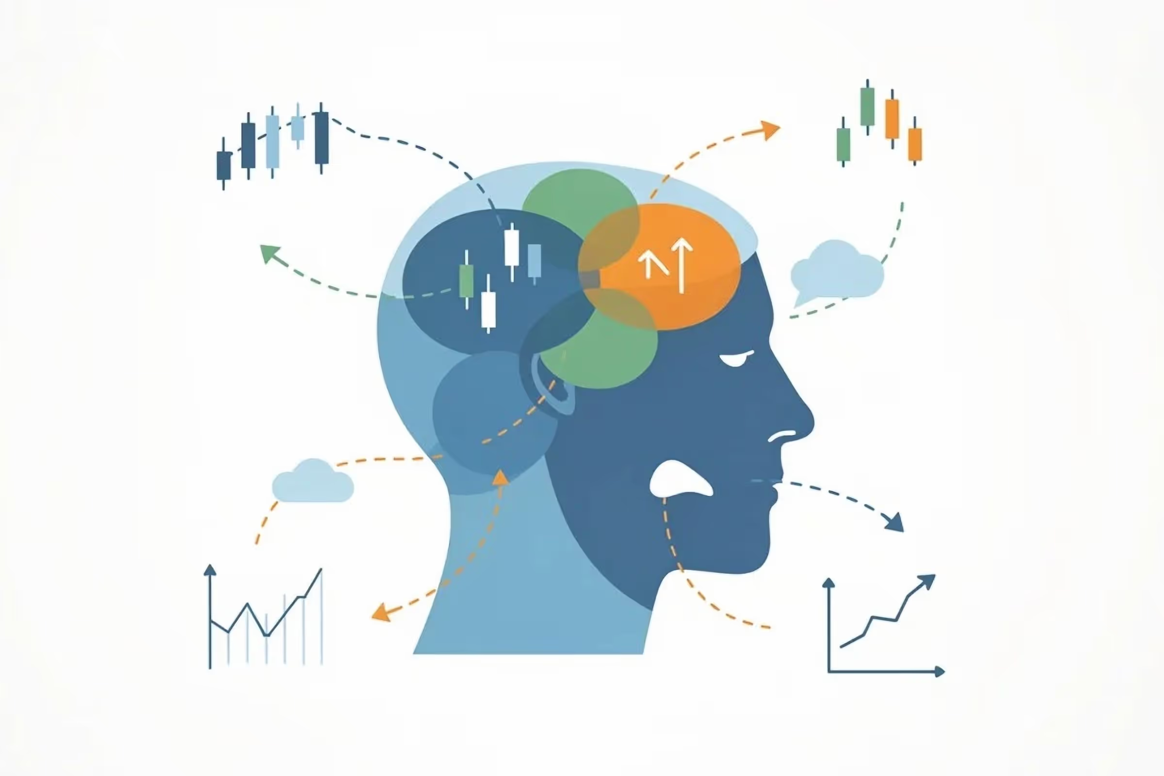
In this article, we will focus on the most widely used chart type - the Japanese candlestick chart. Many traders and analysts rely on this chart format because it provides clear visual information about price movement and market behavior.
In the sections that follow, you will learn why candlestick charts have become so popular among traders and why I personally rely on them when analyzing the markets. But before we explore the details, it is worth briefly looking at the history of this charting method.
The Story Behind Japanese Candlestick Charts
Japanese candlestick charting dates back to the 1700s in Japan, long before modern Western technical analysis developed. The method is often credited to Munehisa Honma, a successful rice trader from the city of Sakata.

Through his trading experience, Homma recognized that while supply and demand influenced prices, traders' emotions and behavior also played an important role in market movements. By carefully documenting price activity, he developed a visual way to represent market movement using what we now call candlesticks.
As traders began using this method to observe price behavior over time, they noticed that certain candlestick patterns tended to recur during shifts in market sentiment. Some of these formations, such as the Doji, Hammer, and Shooting Star, are still widely used by traders today.
Although candlestick charting had long been known in Japan, it became popular in the Western world during the 1980s, largely due to the work of financial analyst Steve Nison, who introduced the technique in his book Japanese Candlestick Charting Techniques.
Since then, candlestick charts have become one of the most widely used tools in technical analysis, helping traders better visualize price movement and understand market behavior.
Now that you have a brief understanding of how the candlestick technique emerged, let’s return to the main topic and take a closer look at what candlestick charts actually are and how they represent price movement in the market.
What Are Candlestick Charts?
A candlestick chart is made up of individual candlesticks, and each candlestick represents the price activity that occurred during a specific period of time.
The length of that period depends on the timeframe a trader chooses. For example, some traders analyze very short intervals such as one-minute or five-minute charts, where each candlestick reflects only a few minutes of price movement. Others prefer longer timeframes, such as daily, weekly, or even monthly charts that capture broader market trends.
Because candlesticks can be applied to virtually any timeframe, they are useful for a wide range of trading and investing styles. Whether someone is studying short-term price fluctuations or longer-term market trends, candlestick charts provide a flexible way to visualize price movements.
The Basic Structure of a Candlestick
Every candlestick contains a small amount of information about what happened in the market during a specific session. Although candlesticks may look complex at first, they are actually made up of two simple components:
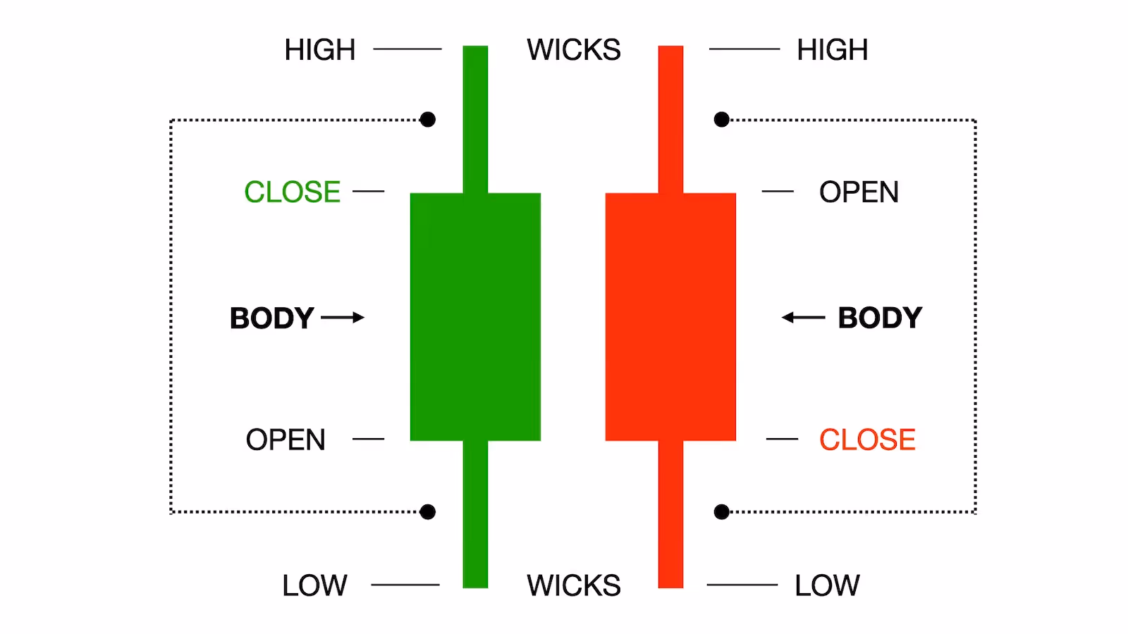
- The body
- The wicks (also called shadows)
Understanding these parts helps traders interpret the behavior of buyers and sellers during that period.
The Body of the Candlestick
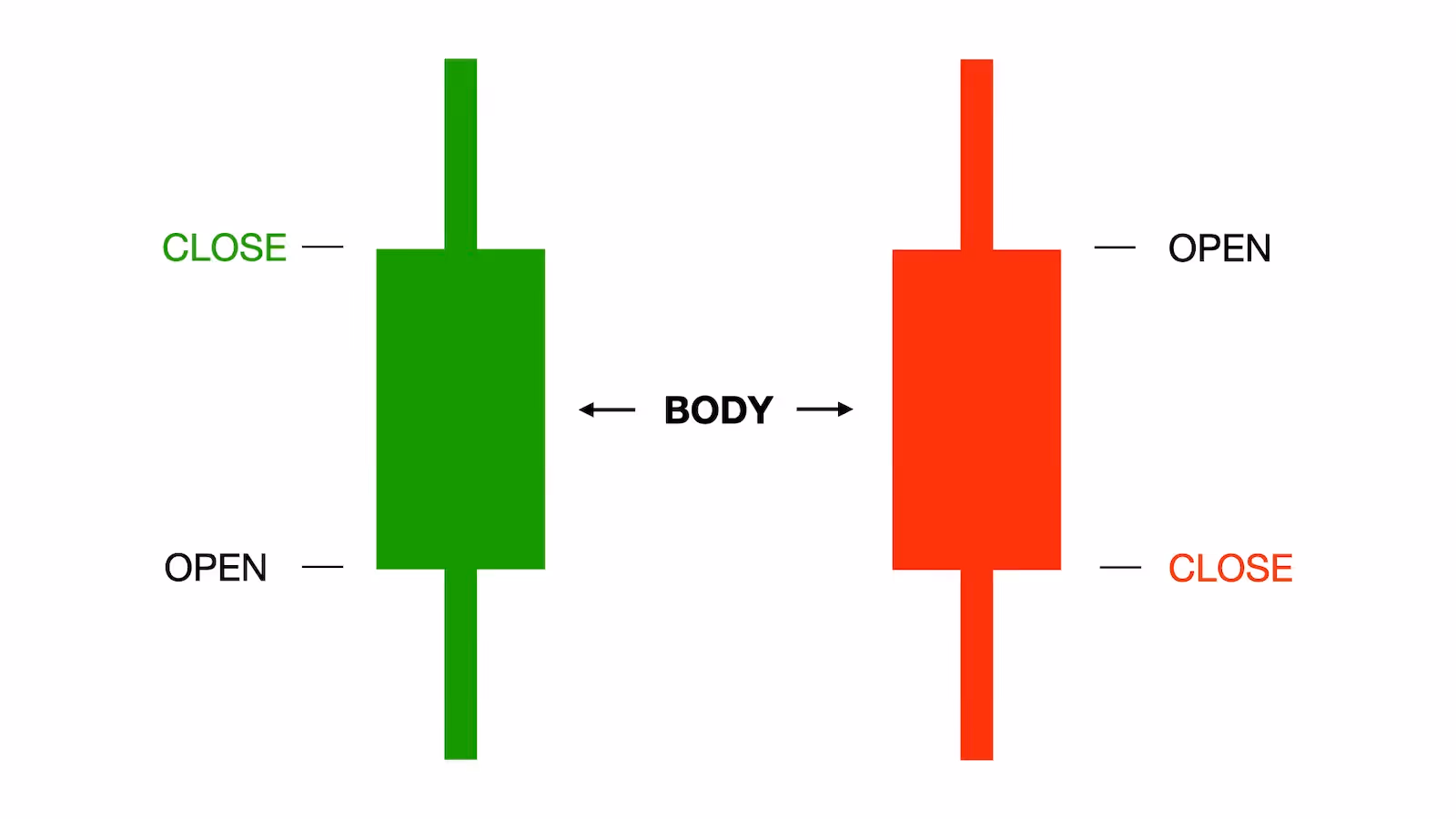
The rectangular portion of the candlestick is known as the body. This section shows the difference between the opening and closing prices during the trading session.
When the closing price is higher than the opening price, the candle is usually displayed in green (or sometimes white). This indicates that buyers were stronger during that session, pushing prices higher.
When the closing price is lower than the opening price, the candlestick is typically red (or black), signaling that sellers had greater control and pushed the price downward.
Because of this color difference, the body of the candlestick provides a quick visual indication of the market's overall sentiment during that period.
A green candle often reflects buying strength, while a red candle reflects selling pressure.
The Wicks (or Shadows)
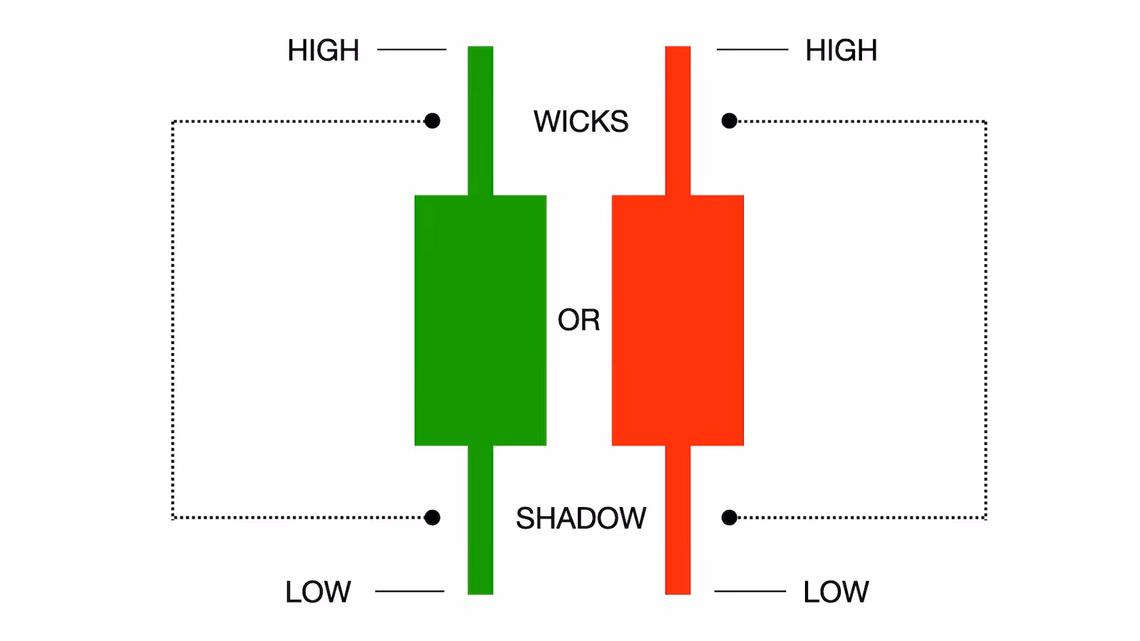
The thin lines extending above and below the candlestick body are called wicks, sometimes referred to as shadows.
These lines show the full range of price movement during the trading session.
- The upper wick represents the highest price reached.
- The lower wick represents the lowest price reached.
Together with the body, the wicks show the four key pieces of information that every candlestick contains:
- Opening price
- Closing price
- Highest price
- Lowest price
This combination allows traders to quickly see how far the price moved and how the market behaved during the session.
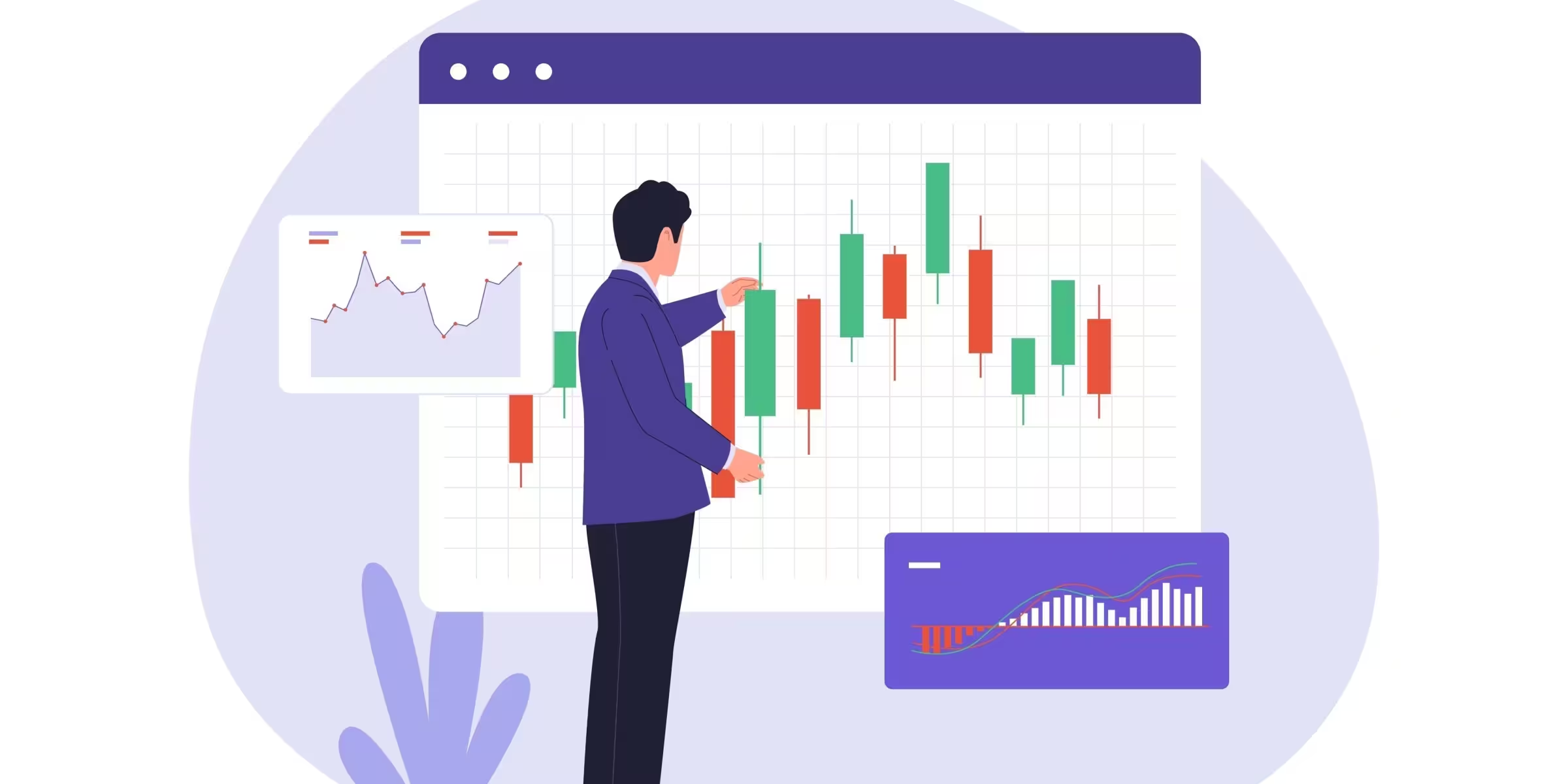
Why Candlestick Charts Are So Popular
Candlestick charts provide far more information than other types of charts, such as line charts. Instead of showing only the final price of a session, each candlestick provides a snapshot of how the market moved over that period.
With a single candlestick, traders can quickly see not only where the price opened and closed, but also how it behaved throughout the entire trading period.
For example, imagine the price opens at a certain level and then suddenly drops for a while before reversing and climbing back up, eventually closing well above the opening price.

This type of price action suggests that buyers regained control and pushed the market higher before the session ended, resulting in a strong bullish close. The reason behind the move, whether it was news, a report, or something else, is not always the most important factor. What matters is that buyers stepped in aggressively during the session, which can sometimes signal continued momentum in the following trading period.
This ability to show the entire story of price movement is one of the main reasons candlestick charts are so widely used. Unlike simple line charts, which typically display only the closing price, candlesticks provide a much clearer picture of what actually happened during each trading session. Because this information is presented visually, candlestick charts are often easier to read and interpret than many other chart types.
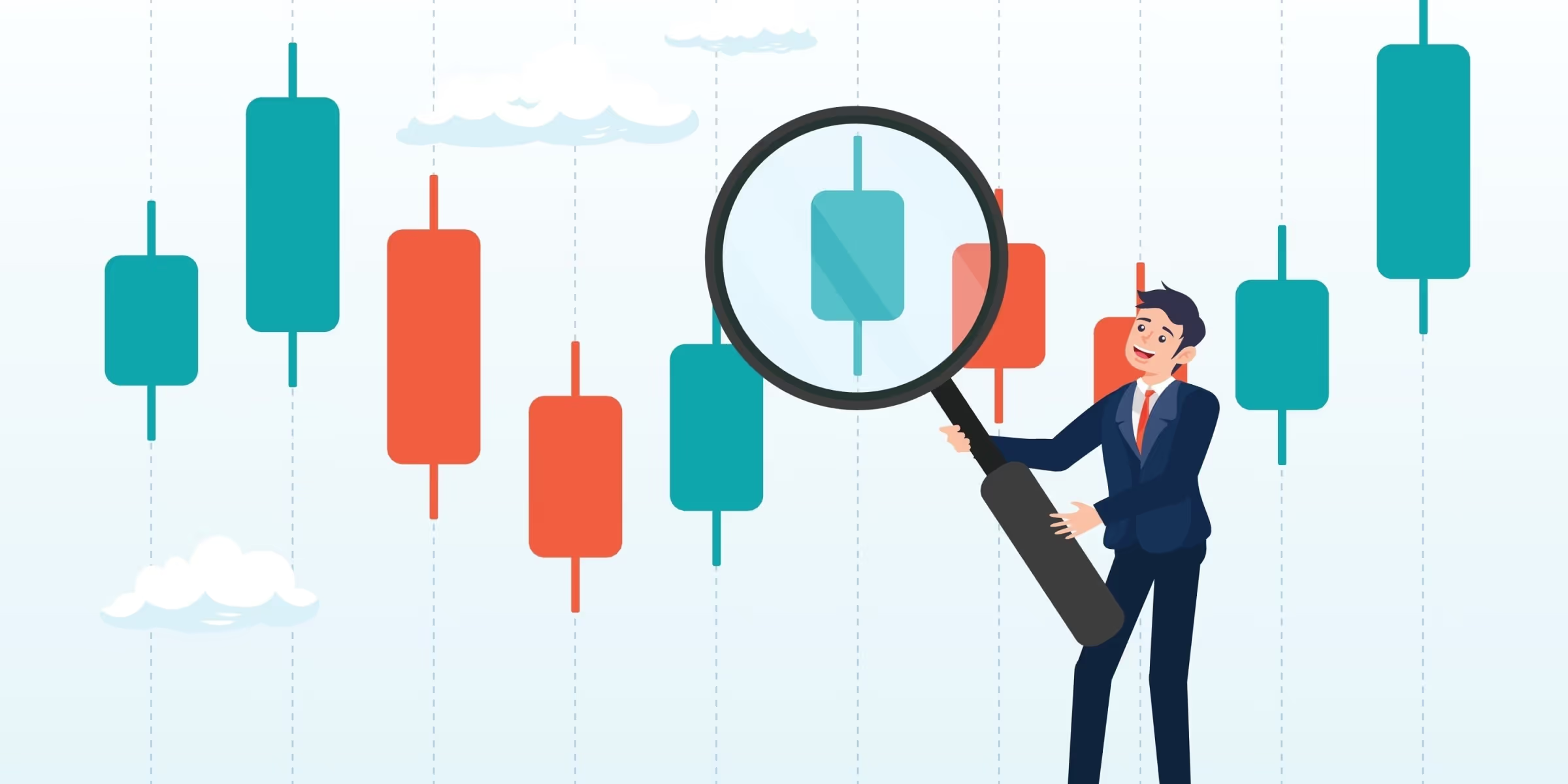
Another important reason I personally use candlestick charts is their ability to form recognizable patterns that often provide clues about where the price might move next. They tend to appear repeatedly in similar market conditions if you can spot them.
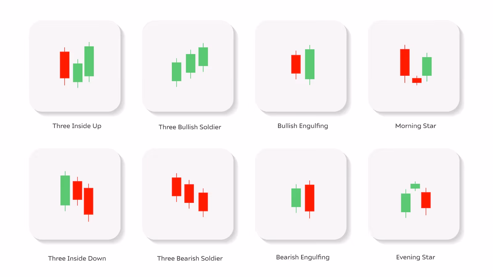
These patterns have specific names and meanings, and many traders watch for them because they can signal potential shifts in market sentiment.
The strength of these patterns often depends on where they appear on the chart. The location of a pattern often matters just as much as the pattern itself.
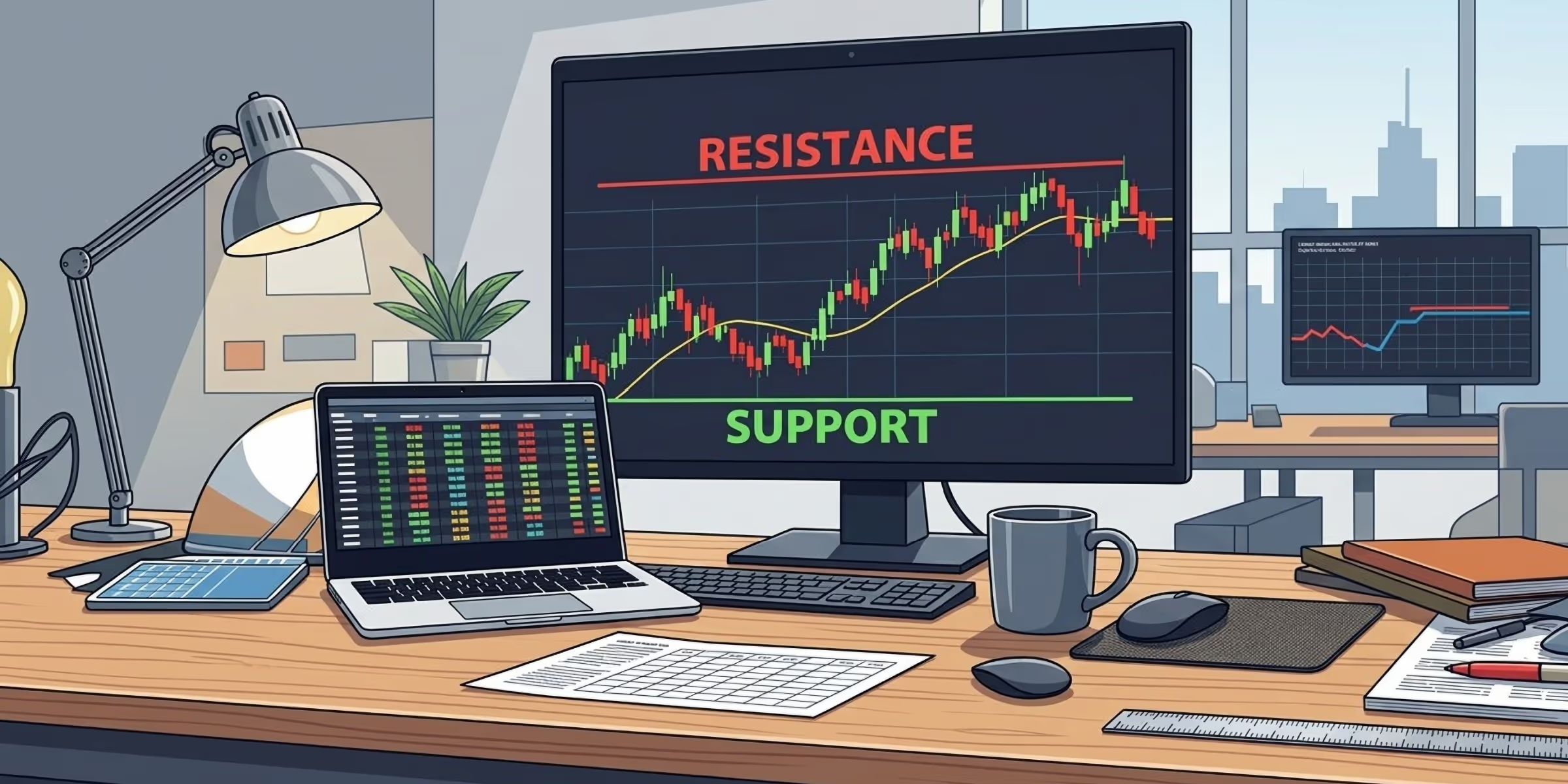
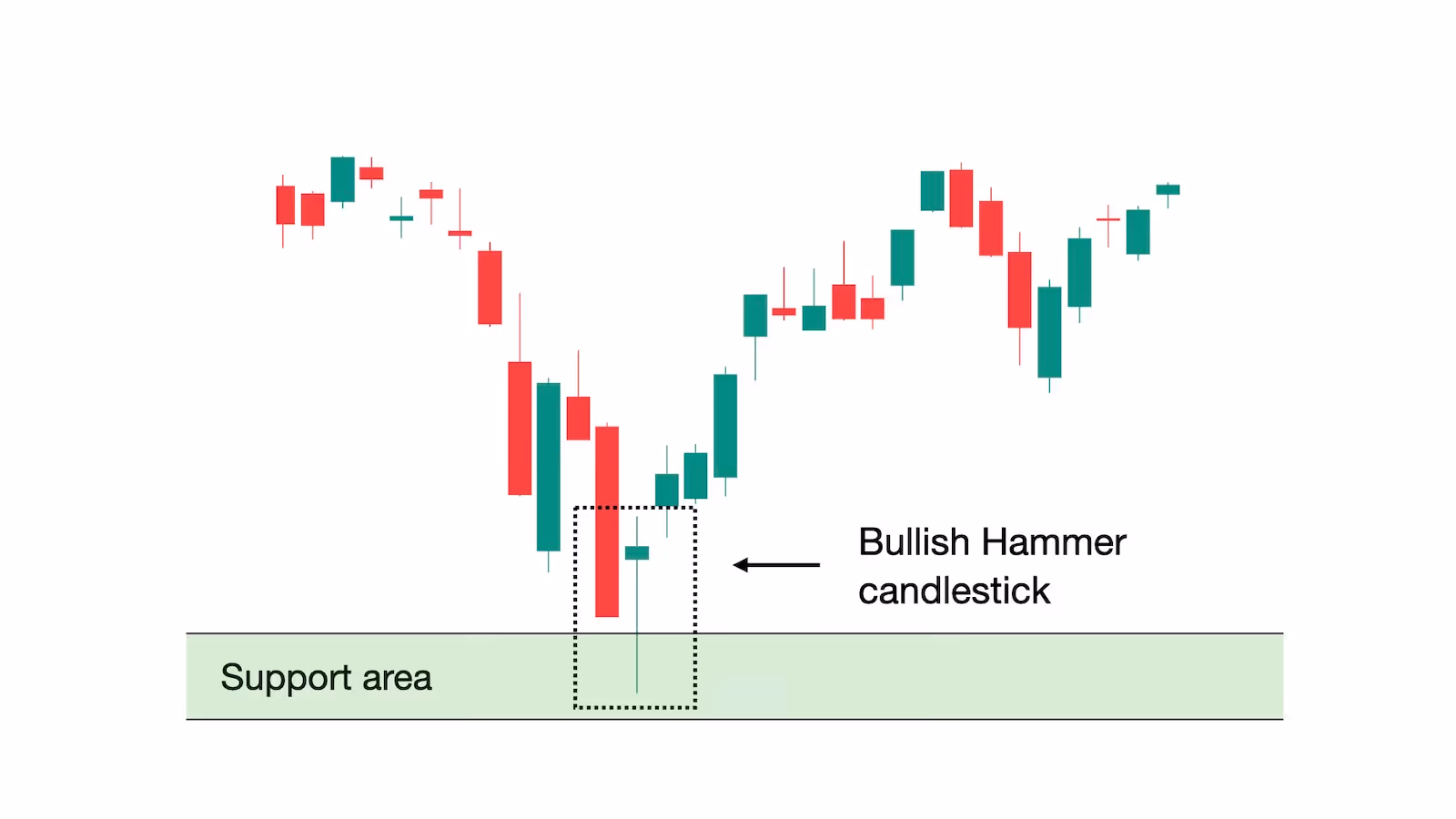
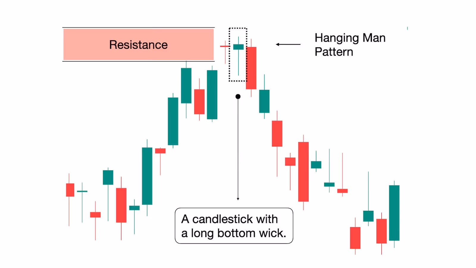
For instance, a hammer candlestick forming near a strong support level can suggest that sellers attempted to push prices lower but were ultimately overpowered by buyers. This type of price action may indicate that buying interest is returning and that the market could move higher.
On the other hand, a hanging man pattern forming near a resistance level may hint that buyers are losing strength and that a potential reversal to the downside could follow.
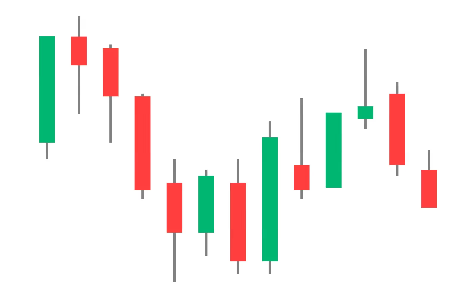
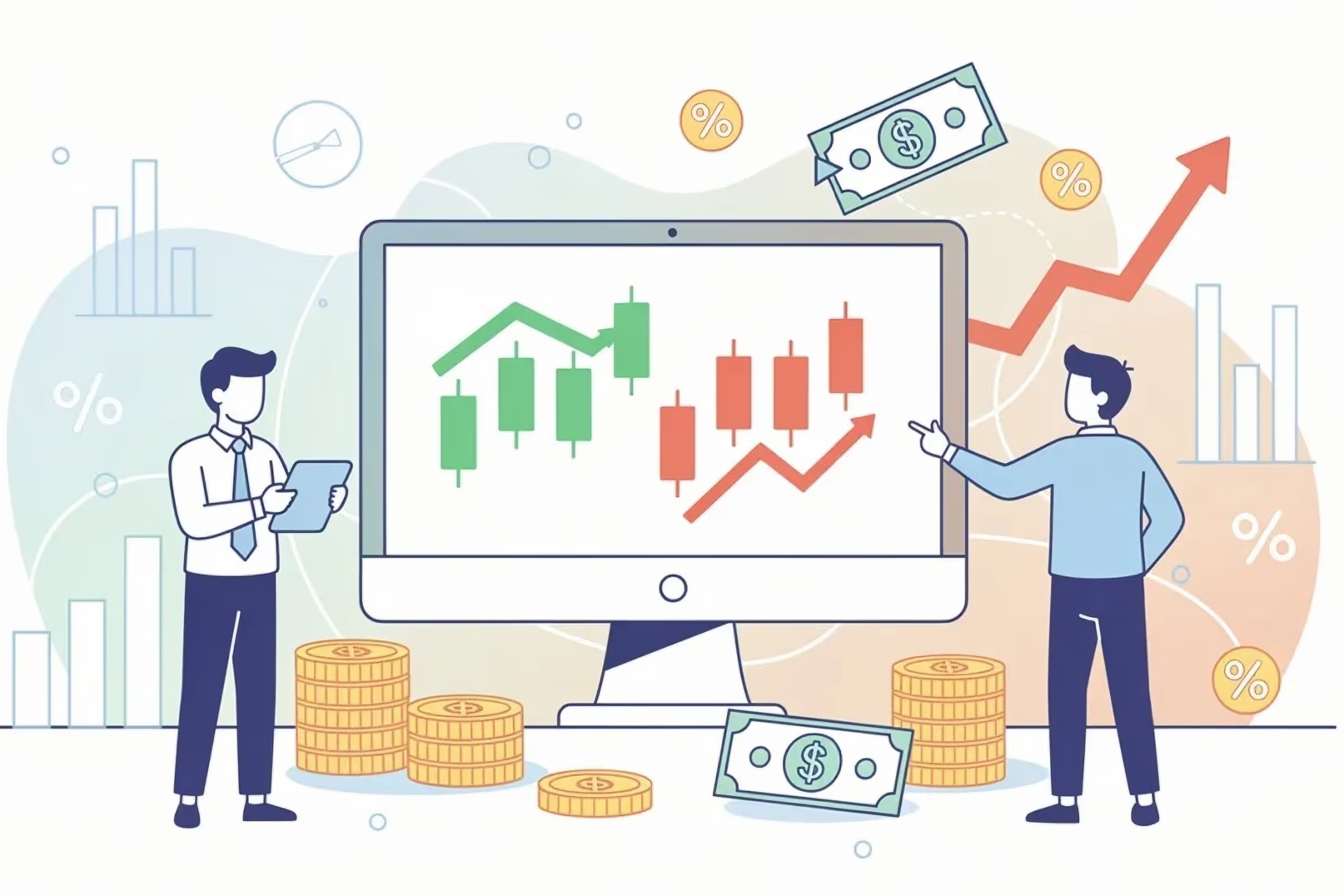
Candlestick signals are not limited to individual patterns. Sometimes the broader sequence of candles can reveal important information as well. For example, a series of consecutive bullish candles may suggest strong buying interest and growing market momentum.
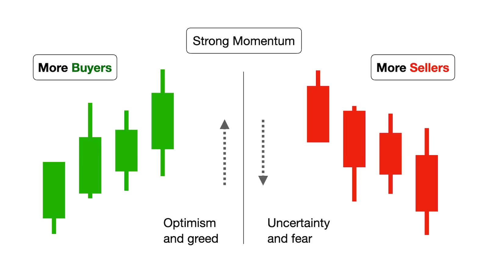
Conversely, several bearish candles appearing one after another can indicate that selling pressure is building and that the market may continue to decline. Observing how these candles form and interact over time helps traders better understand the balance between buyers and sellers.
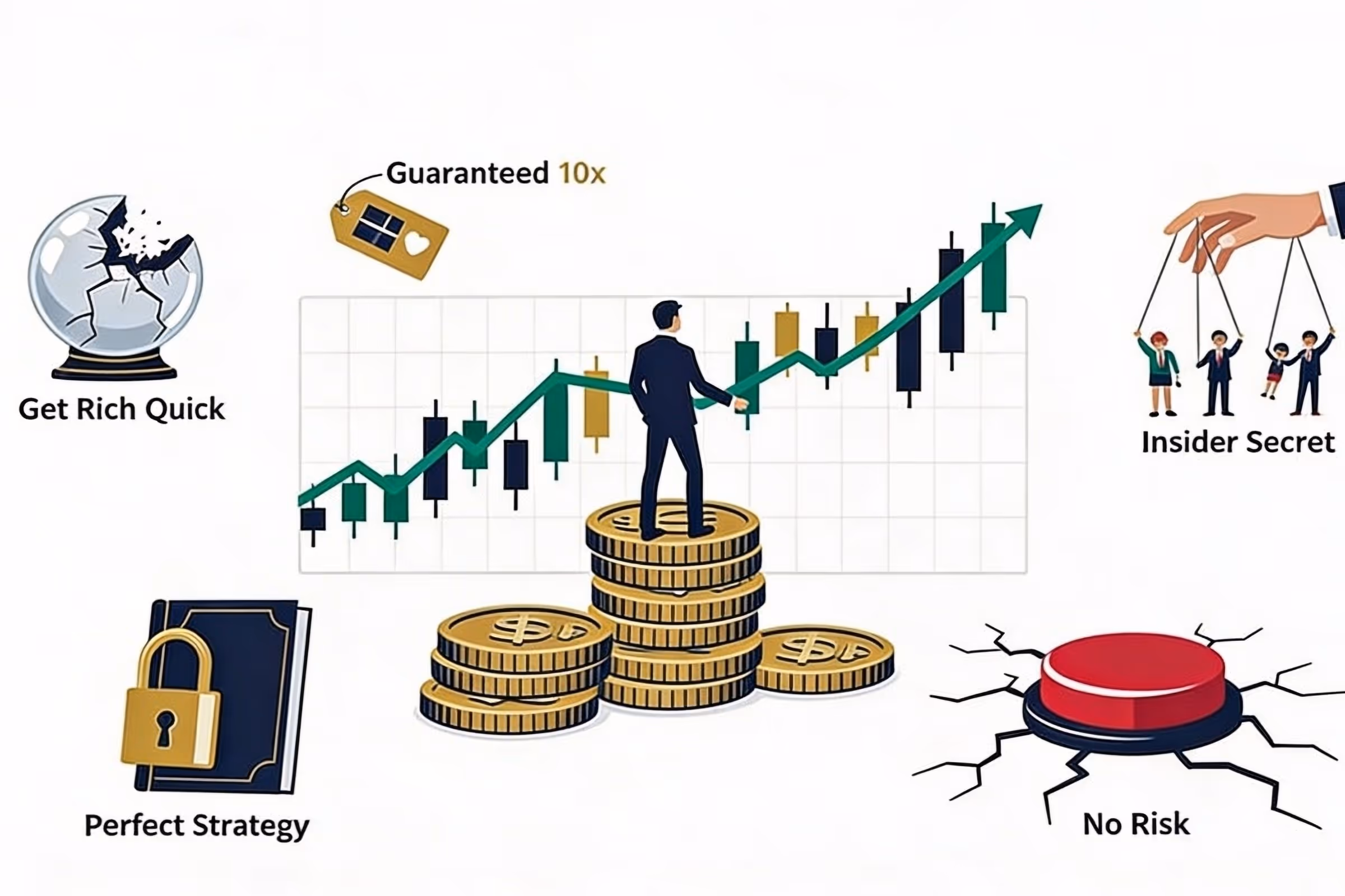
Learning to recognize these patterns through your own analysis is what gives a trader an edge. When interpreted correctly, they can provide valuable information about potential opportunities. In many cases, they help traders make decisions based on price action rather than guesswork. However, it is important to do the research yourself and not to blindly follow signals or strategies from others without fully understanding them first, a mistake I discuss in my article about the risks of following random trading advice.
Of course, candlestick patterns are only one piece of the puzzle. Understanding how to properly identify them and where they are most meaningful takes time and practice. In future lessons and articles, we will explore these patterns and formations in much greater detail so that you can begin to recognize them and understand how they may fit into your trading strategy.
Candlesticks and Market Psychology
Beyond pattern formations we could use in our research, candlestick charts can also provide valuable insight into how traders think and react in the market.
In many ways, candlesticks reflect the psychology of market participants.
Each candlestick represents the interaction between buyers and sellers during a specific trading period. In other words, every candle captures the ongoing struggle between those who believe prices should move higher and those who expect them to fall. Understanding this battle between market participants is also closely related to the psychological factors that cause many traders to struggle, something I discuss in more detail in my article on why many traders fail.
When buyers are more aggressive, prices tend to close higher than where they opened. This usually reflects optimism and growing confidence among market participants, and in many cases even a degree of greed as traders rush to take advantage of rising prices. On the other hand, when sellers dominate the session, prices often close lower. This can signal fear, uncertainty, or a loss of confidence in the market.
If you are interested in learning how uncertainty influences the markets, you can read my article that discusses this exact topic here.
By simply observing whether a candlestick closes higher or lower, traders can already begin to understand which side had more control during that trading period.
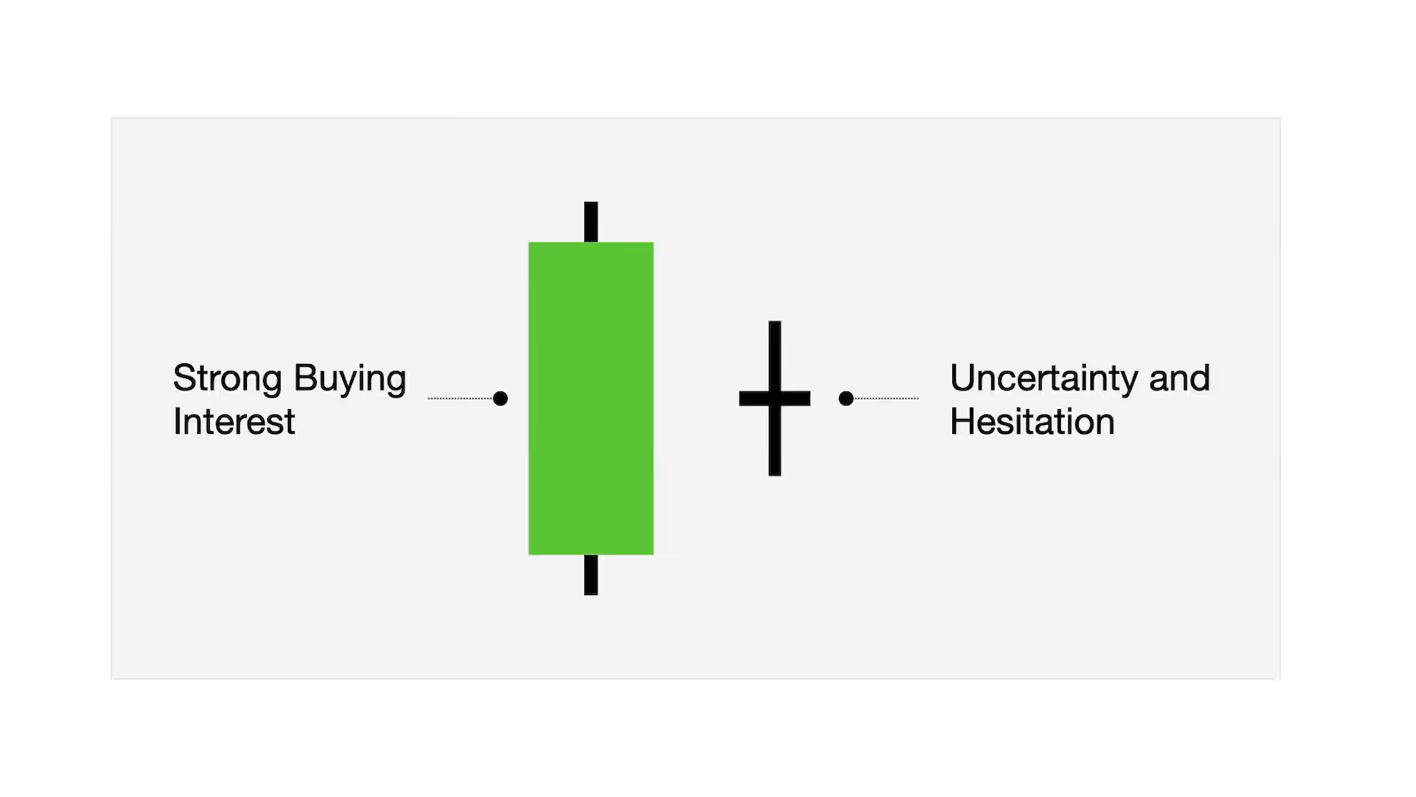
The shape and size of a candlestick can provide additional clues about how strong that battle was. Large candles often indicate that significant trading activity occurred and that one side clearly gained control during the session.
For example, a large green candle usually suggests that buyers stepped in with strong momentum, pushing prices upward with conviction. Smaller candles, on the other hand, may indicate hesitation or indecision, where neither buyers nor sellers were able to establish clear dominance.
A powerful example of this can be seen during periods of extreme market stress. During the financial crisis of 2008, stock charts were filled with large red candlesticks as markets rapidly declined.
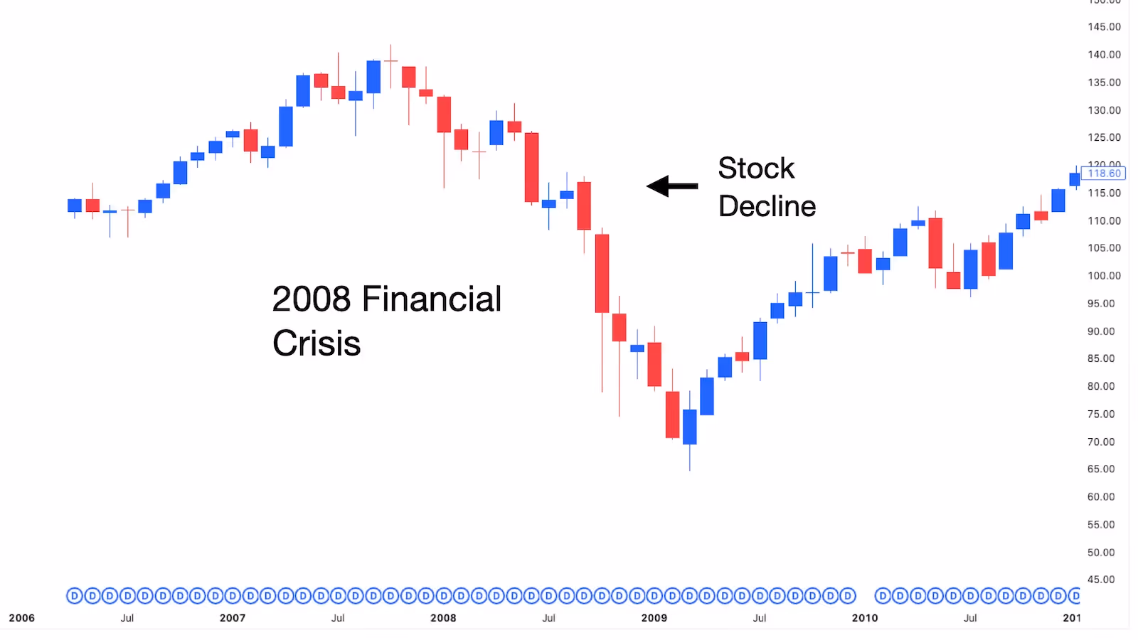
These oversized candles visually tell us the intense fear and panic that spread among investors at the time. Even without knowing the specifics of those moves, simply looking at the chart makes it clear that the market was under heavy selling pressure and in a state of widespread panic.
Because of this, many traders view candlestick charts as more than just a way to track prices. They see them as a visual representation of market sentiment and human behavior. Each candlestick tells a small part of the story, and when viewed together, they can reveal how optimism or fear dictates market direction.
Closing Thoughts
Since I’ve started trading, Japanese candlestick charts have become one of my most widely used tools for analysis because they offer a clear visual way to understand what the price is actually doing. With just a single candlestick, I can quickly see where the market opened, how it behaved during the session, and where it closed.
What I personally appreciate most about candlestick charts is that they reveal more than just price changes. They often give clues about the ongoing battle between buyers and sellers and how market participants are reacting to different situations.
If you want to become better at interpreting market moves, learning to read candlesticks is a very important first step. Of course, becoming profitable in this business requires much more than just understanding charts, as I explain in my article “How Long It Takes to Become Profitable.” However, you are already ahead of many others who are still unsure about what to do and where to start.
In future articles and lessons, we’ll take a closer look at some of the candlestick formations that traders often watch for and discuss how to interpret them within the broader context of market analysis.
My goal is to help you gradually learn how to read charts and recognize the kinds of signals experienced traders watch for when searching for their next potential trade.
Topics
Trading Myths

Beginner Trading
Technical Analysis
Market Education

Risk Management